⚠️ Disclaimer
This article is for educational and awareness purposes only. It does not promote deceptive design or encourage unethical user experience practices. All examples are analyzed in compliance with international UX, data protection, and cybersecurity standards.
🔍 Introduction: The Friendly Trap You Didn’t See Coming
You think you’re just closing a popup. Or skipping a newsletter. Or unsubscribing from a service you never use.
But behind the scenes, you’ve been nudged, tricked, or misled — not by a person, but by pixels, buttons, colors, and layouts that quietly betrayed your intent.
Welcome to the world of dark patterns — where design becomes deception.
Coined by UX specialist Harry Brignull in 2010, dark patterns are manipulative interface techniques used to steer users into actions they didn’t consciously choose, like signing up, spending money, or surrendering data.
They live in privacy settings, cancel buttons, cookie banners, and checkout flows — often hiding in plain sight.
This isn’t poor design. It’s intentional manipulation.
🧠 What Are Dark Patterns?
Definition: Dark patterns are UI/UX design strategies that exploit human psychology to trick users into taking actions they otherwise wouldn’t take.
They are legal in many countries but ethically questionable. Often used by tech giants, e-commerce sites, and apps, these tactics thrive on asymmetry: you don’t know what they know.
🎯 The Psychology Behind It:
- Cognitive overload: Too many options confuse you.
- Choice architecture: The “easiest” option is often the most profitable for the company.
- Loss aversion: People are more likely to avoid losses than seek gains — dark patterns exploit that.
- Visual hierarchy: Emphasizing one button over another isn’t just design — it’s persuasion.
🧩 Types of Dark Patterns (with Real Examples)
| Dark Pattern Type | Description | Real-World Example |
|---|---|---|
| Roach Motel | Easy to get in, hard to get out | Subscribing takes 1 click, unsubscribing takes 7 |
| Confirmshaming | Guilt-tripping you into staying | “No thanks, I don’t care about saving money” |
| Disguised Ads | Ads look like navigation buttons | “Download” button that’s not the real one |
| Forced Continuity | Free trial auto-renews with no reminder | Common in video streaming platforms |
| Hidden Costs | Unexpected fees at checkout | Airline ticket suddenly jumps by $60 |
| Privacy Zuckering | Tricking you into sharing more data | “Accept All” button in massive green, “Settings” in tiny gray |
| Trick Questions | Complex language misleads users | “Uncheck this box if you don’t want to be opted in” |
| Misdirection | Focuses attention away from what matters | Bold “Yes,” hidden “No thanks” |
🧪 Case Studies: Dark UX in the Wild
📦 Amazon’s “Prime Trap”
Amazon was accused in 2023 by the FTC of making it difficult for users to cancel Prime subscriptions. The “cancel” process included multiple screens, unclear language, and confirmation loops.
It worked — most users gave up halfway.
🎮 Epic Games and the $245 Million Fine
In 2023, Epic Games (makers of Fortnite) were fined $245 million by the FTC for using dark patterns that tricked kids into in-game purchases.
Buttons were confusingly placed, and purchase confirmations were minimal. Parents found out only when credit card bills exploded.
📱 Cookie Banners in the EU
Many websites comply with GDPR using cookie banners — but only technically.
They hide “Reject All” under multiple clicks while “Accept All” is immediate and bold. The deception is legal but deeply unethical.
🧠 The Shame Game: When Refusal Becomes a Psychological Attack

Not all manipulation in UI design is technical. Some of it is emotional.
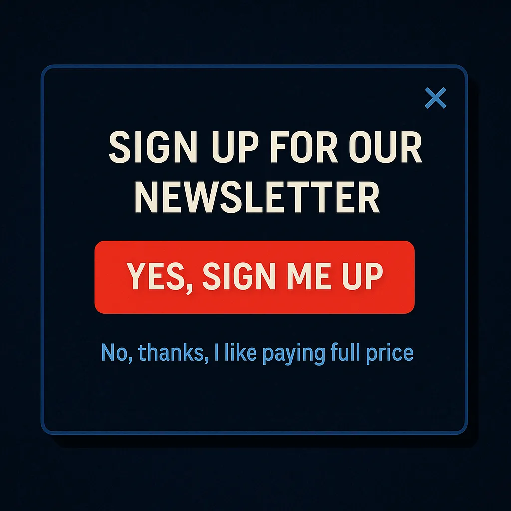
Take, for instance, the tactic known as confirmshaming — where opting out isn’t just an action, it’s a confession. A pop-up might present two options:
- YES, SIGN ME UP (in bold red)
- No, thanks, I like paying full price (in passive gray)
What should be a neutral choice is suddenly twisted into a moral judgment. The design implies that declining an offer is irrational or foolish — making users feel guilty, cheap, or even stupid for saying “no.”
This isn’t UX.
It’s psychological warfare.
These micro-aggressions in design don’t just erode trust — they rewire decision-making. Over time, users learn to avoid shame rather than make rational choices. That’s not consent. That’s coercion.
🧠 Why It Matters
Dark patterns exploit the trust gap between users and platforms.
They corrode confidence, weaken user autonomy, and often disproportionately affect the most vulnerable: children, the elderly, or those less tech-savvy.
They also:
- Distort analytics (because users didn’t truly intend those clicks)
- Create long-term brand distrust
- Often operate in gray legal zones, risking regulatory blowback
🌐 Regulation & Pushback
| Country/Region | Legal Status of Dark Patterns | Notable Action |
|---|---|---|
| USA (FTC) | Actively cracking down | Epic Games, Amazon |
| EU (GDPR) | Indirectly banned via consent laws | Cookie interfaces under scrutiny |
| India | Emerging regulation | Draft laws on deceptive UX in fintech |
| California (CPRA) | Mentions user rights over design practices | Still evolving |
In 2022, Brussels declared dark patterns illegal under its Digital Services Act (DSA), while California’s CPRA added clauses protecting users from manipulative interface designs.
✅ How to Spot a Dark Pattern
- You’re unsure if you agreed to something.
- You can’t find the cancel button.
- The default action always benefits the company.
- The design feels more confusing than it should.
- You regret an action right after doing it.
🔐 How to Protect Yourself
- Use browser extensions like uBlock Origin or Consent-O-Matic to auto-decline trackers.
- Always read before clicking — especially on popups or email opt-ins.
- Disable auto-renewal immediately after signing up.
- Practice slow UX: If something feels rushed, pause.
- Report deceptive designs to regulators (FTC, EU Data Protection authorities).
🧭 Glossary
| Term | Definition |
|---|---|
| Dark Pattern | A UI tactic designed to trick users |
| Roach Motel | Easy sign-up, difficult cancellation |
| Confirmshaming | Guilt-based opt-out phrasing |
| Zuckering | A term for tricking users into giving data |
| Forced Continuity | Subscription continues without notice |
| Choice Architecture | The way options are visually and logically presented |
| Misdirection | Highlighting one action while hiding another |
❓ FAQ
Q: Are dark patterns illegal?
A: Not universally. Some countries (like those in the EU) are actively regulating them. In others, it’s still a gray area.
Q: Is it unethical to use dark patterns in business?
A: Yes — even if it’s legal. It betrays user trust and can backfire long-term.
Q: Can I protect myself using browser settings?
A: Yes — disable third-party cookies, decline tracking, and use plugins that block manipulative popups.
Q: Why do companies use dark patterns?
A: Because they work. Higher conversion, more signups, fewer cancellations — at the cost of transparency.
🧠 Final Thoughts: When Design Becomes Deception
Good design empowers. Dark patterns manipulate.
As we build more connected systems and smarter interfaces, ethical design must evolve too.
Tech should serve users — not trap them.
We don’t need more clever tricks.
We need more transparent design.
